
More than 40 years ago, three Seattle researchers launched an international nonprofit.
They called it PIACT, or the Program for the Introduction and Adaptation of Contraceptive Technology. As PIACT, they bridged partnerships between companies and governments around the world, creating access to the latest contraceptives and sexual health solutions, innovations that weren’t available outside of the world’s wealthiest countries at the time. Their work was visionary and groundbreaking.
Over time, PIACT’s model expanded to other health areas and solutions. In 1980, the organization changed its name to Program for Appropriate Technology in Health. Several decades later, we dropped the acronym and became PATH.

Today we’re announcing another big milestone: we’re transforming PATH’s story with a focus on the future.
The PATH of 2018 is 1,600 employees strong. We’re a 41-year-old start-up that hires some of the most brilliant people in the world to do truly innovative work. We changes lives and reduces deep health inequities around the world. In short, we’ve become the most far-reaching, lifesaving global health organization most people have never heard of.
For too long, our brand hasn’t reflected the enormous progress we’ve made as an organization.
As a brand experience, our website and logo didn’t function as a cohesive system, either. They didn’t feel modern and bold, didn’t unify our many programs and teams, and didn’t tell our story in a clear and concise way. We heard this repeatedly from our partners, donors, and team members: they desperately wanted to tell the world about PATH, but our brand was making it difficult to do so.
Last year, we embarked on the process of rebuilding our global communications strategy and our marketing capabilities. As part of this, we made the decision to fully rebrand.
It was time for a change.

We started our rebrand by rethinking how NGOs communicate.
Nonprofits are not generally known for having compelling brands. We rarely have the best marketing, nor do we excel at telling our stories in a clear, brand-savvy, non-paternalistic manner. In our mission-driven sector we rarely have the budget for top-tier brand building or advertising. We exist to drive social impact, so when given the choice between allocating our dollars to marketing, or on have a direct, life-saving impact, marketing usually takes a backseat.
We believe this needs to change.
When NGOs market well, the work we do can have an even more massive impact. PATH’s rebrand was a major detour from the traditional NGO marketing route. We made a significant investment in this project, and our agencies were incredibly generous along the way in helping us make this happen. But we also had to make countless difficult decisions as we took on this rebrand: We scaled back and staggered the brand rollout. We had to defer new building signage. We weren’t able to send brand swag to our employees. We had to delay building key features on the new website, like making it entirely multilingual.
This is the reality for most nonprofits.

Our world-class rebrand partners
For this initiative we partnered with Manual, a brand design firm known for their work with Nike, Gap, and Medium; and Instrument, an interactive agency whose roster includes Google, Airbnb, and LinkedIn.
Working with Manual, we reimagined PATH’s brand system from the ground up. We looked inside and out of our sector to understand how PATH’s brand sits alongside our peers and our partners. We looked at brands that excel in mobilizing people to take action, those that are seen as global thought leaders, and brands that tell their stories clearly and accessibly. We talked to our team members around the world to understand nuances across different markets and cultures, and we spent time understanding what our offices needed from our brand system and assets. Over the course of a year, we also explored hundreds of directions for our voice and visual system.
 1 of 6
 2 of 6
 3 of 6
 4 of 6
 5 of 6
 6 of 6
Simultaneously, we partnered with Instrument to overhaul our website. Like many academic and government organizations, our website hadn’t been overhauled in more than a decade. It had become a confusing mix of content organized along the lines of our organization's structure instead of our users' needs.
We were supporting a (25,000+ page) mix of research and reports, advocacy and training materials, press releases and blog posts, marketing assets, and in-depth information about hundreds of projects around the world, including dozens that had long-since ended. The site grew cumbersome to navigate and was no longer optimized to serve as a trusted portal to global public health. And the management and maintenance of the site, its lack of flexibility, and its dated functionality made it inefficient and difficult for our team to run it like a modern publishing site.
A year later, we are proud to unveil the PATH of the future:
Our logo
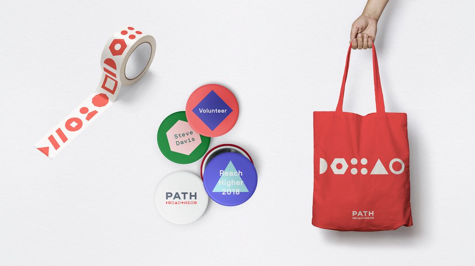
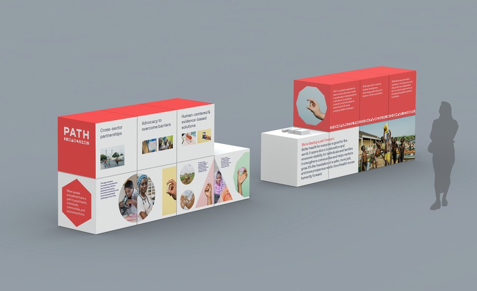
We explored many directions and unanimously chose a logo that boldly emphasized our name, PATH. A path is a line and a way forward in the world. Originally, a line under the word PATH expressed that idea. But PATH also contains many people around the world working together in sequence, so we turned the line into a dotted line. Then we went one step further: Unlike any other health organization in the world, PATH works on all pieces of the global public health puzzle. So the dotted line under our name became a series of abstract and geometric shapes that represent the diverse and innovative methods we employ to address global health challenges.
In its final form, our logo triggers connotations of networks, partnerships, and initiatives working together for a common goal. This logo is not meant to be interpreted: The string of geometric shapes is not a code or a secret language; there is no legend or key. We added some shapes that evoke ideas of humanity, digital health, engineering, and more. Intentionally, these geometric shapes are so abstract and elemental that a child might recognize them.

Our visual system
The line of abstract symbols in our logo becomes the design system for all PATH communications across print and digital. The stories and photos in our communications are often framed by these geometric shapes. This is no accident: By reading these stories you are zooming into our logo, deep into that string of symbols. As you read, click, and scroll, you’ll start to see the true DNA of PATH.
Not only does this treatment help to unify our photography, but it gives our imagery a unique style. You can cover up our logo on any brochure, report, or document and still recognize its distinctive design as coming from PATH.
It's also a simple design system to use, so staff around the world can use these shapes to achieve the ”PATH look.”

Our photography
Taking a critical look at our imagery was one of the most important aspects of this rebrand. From now on, our photography will move away from traditional nonprofit photography. There are talented photographers everywhere in the world, not just in the global north. So when we have a story to tell in Dakar, we will hire a Senegalese photographer to tell it. Our photography will focus on our global team and partners doing innovative work in our communities and countries.
This approach is part of our continuing effort to deliver appropriate content while investing in the economic development in the communities where our team members live and work.

Our colors
To honor PATH’s past and to maintain a level of consistency and recognition, we’ve carried red over as our logo and “hero” color, though we’ve updated it to a vibrant new shade of coral red. It's lighter and more contemporary.
To extend the vibrancy and flexibility of the design system, we’ve created a palette of colors that can complement or contrast with our vibrant mid-range palette. Darker colors allow for a bolder and more sophisticated look, while a pastel palette adds lightness—particularly to our new hands-with-device photography.

Our typography
Alongside our new bold PATH word-mark, which was custom drawn by Manual, the typography we chose for all of our communications was carefully considered. Clarity and simplicity were key when considering our typographic voice. Our new brand typefaces are NB International and NB Akademie—both designed and published by Neubau Berlin.
NB International is our primary typeface for print and web. It is a geometric sans serif typeface with a warm character and some unique visual traits that add personality. NB Akademie is a natural pairing with NB International. We use it on our website, as it is slightly more condensed and suits screen-based media.
Both typefaces lend a clear yet unique typographic voice to PATH while differentiating our messages from other nonprofit organizations.
 1 of 5
 2 of 5
 3 of 5
 4 of 5
 5 of 5
Our voice
In the past, our messaging was a collection of disparate, if brilliant, stories about our products and services—like a malaria vaccine being trialed, a sexual health community on Facebook, or a low cost continuous positive airway pressure (CPAP) device invented for premature infants. For decades, we’ve wowed people with examples of our expertise. But the bigger story of who PATH is as a whole was often missing.
In the new brand system, we’ve pulled the stories of our work together under a single umbrella. Now, we have a new brand story that unifies us with one human, evidence-based, clear, optimistic, and bold voice. It universally describes who we are, what we believe, how we think and operate, and, of course, what we do.
We are insightful problem solvers. We are scientists, product designers, behavior change experts, engineers, writers, solvers, and makers of change. We’ll show how we use that expertise in new ways to create a better future in partnership with others.
We are thoughtful and empathetic. Our storytelling reflects our global team and gives agency to everyone in the story. We don’t use flowery or punny language in the face of sensitive topics; rather, we communicate with expertise and care.
We tell globally understood stories without jargon. We have offices in more than 70 countries. This makes clear communication paramount: we speak plainly, explain with intelligent simplicity, and work concisely.
We plan for the future. Even when we’re talking about difficult subjects, we frame our perspective with a focus on solutions. There is the potential for positive change in every arena, and we offer guidance, reinforcement, and hope.
We are daring and direct. We’re making change happen, and we’ve been quiet for far too long about it. We’re putting our stake in the ground and finally telling the world who we are and what we’re proud of.

Our website
People visit our website to understand who PATH is, what we do, what expertise we have to offer, and the scope of our impact. User testing of words, concepts, and navigation pointed us to a site structure that moves the overall, unified PATH story more to the foreground and clarifies our two broad areas of effort: the kinds of solutions we work on and the health areas where we focus our impact.
Building on the visual language of the new brand, we created a clean design that will feature powerful visual and written storytelling for those who are just learning about our work or following our story, while making our technical resources more findable and prominent for our peers.
This isn’t just about a new logo or a new website.
This is about so much more than that. PATH’s new branding is about transforming the way you see us. It’s about shouting our mission and our learnings from the rooftops in a business savvy way.
It’s about inspiring other NGOs to do the same.
It’s about encouraging donors to support nonprofits’ branding and marketing needs so we can operate like effective international organizations. It’s about making sure that people like Priscilla Chan and Mark Zuckerberg know our name. It’s about telling you more about what we need and why in a mobile friendly way.
It’s about building a new path for humanity where better health means stronger countries, growing markets, shifting economies, and social progress for all. I hope you’ll join us because this path starts with you.

